01
OVERVIEW
During my internship apart from building a website for Camilo, a psychologist from Chile, I also worked on creating a visual identity for his brand. This was essential in establishing a strong and cohesive online presence, reflecting his values and professional expertise.
Client
Camilo's Therapy
My role
Graphic Design
Visual Identity
Industry
Mental Health
Project type
Internship
02
problem & concept
It was quite challenging to create a symbol that truly represented Camilo while also reflecting his profession. Numerous sketches were drawn, exploring various logotype concepts aimed at embodying Camilo's core values, such as personalized care.
Initially, none of the designs felt personal enough until the concept of 'roots' emerged. Delving into Camilo's background as a native of Chile became a pivotal reference to the fact that our early experiences profoundly shape our psychology.
In the field of psychology, reflecting on our formative years helps us understand our current thoughts and behaviors and that is why it seemed authentic to look back at Camilo's roots in order to symbolize this connection.
03
concept
Camilo's personal experience of relocating abroad for studies not only equips him to assist both English and Spanish speakers but also enables him to deeply understand their pain points.
Recognizing the significance of this shared experience, he framed it as a unique selling proposition (USP) in his practice.
This personal connection underscores the importance of representing his background and roots in the visual identity, aligning with his mission to empathize with and support individuals navigating similar challenges.
04
solution
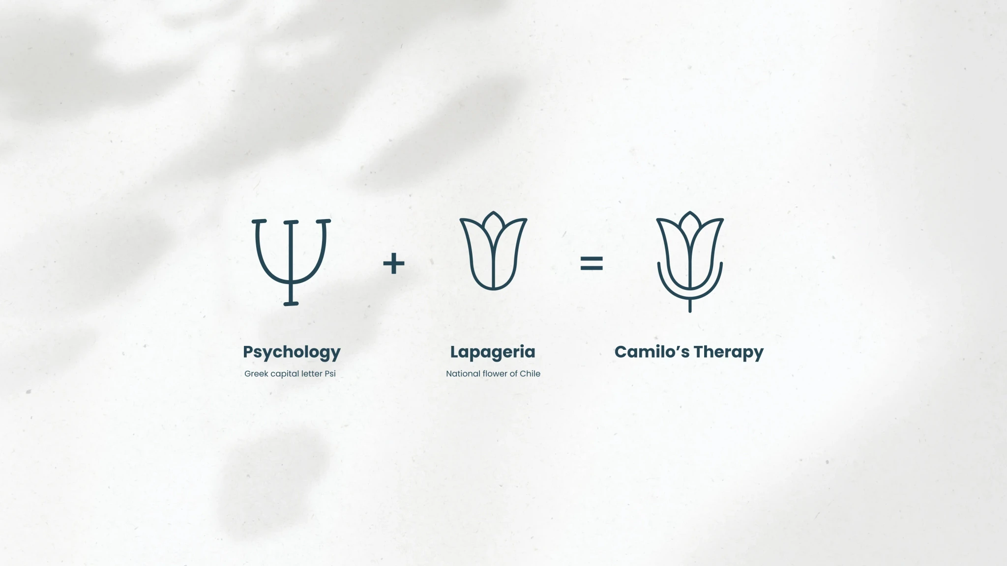
The Lapageria, Chile's national flower, became significant as it symbolizes home, roots, and personal growth—the very essence of therapy.
When combined with the psychology symbol surrounding the flower, it conveys the idea that through psychology and self-discovery, individuals can grow, reach their full potential, and experience inner peace and happiness.
05
solution
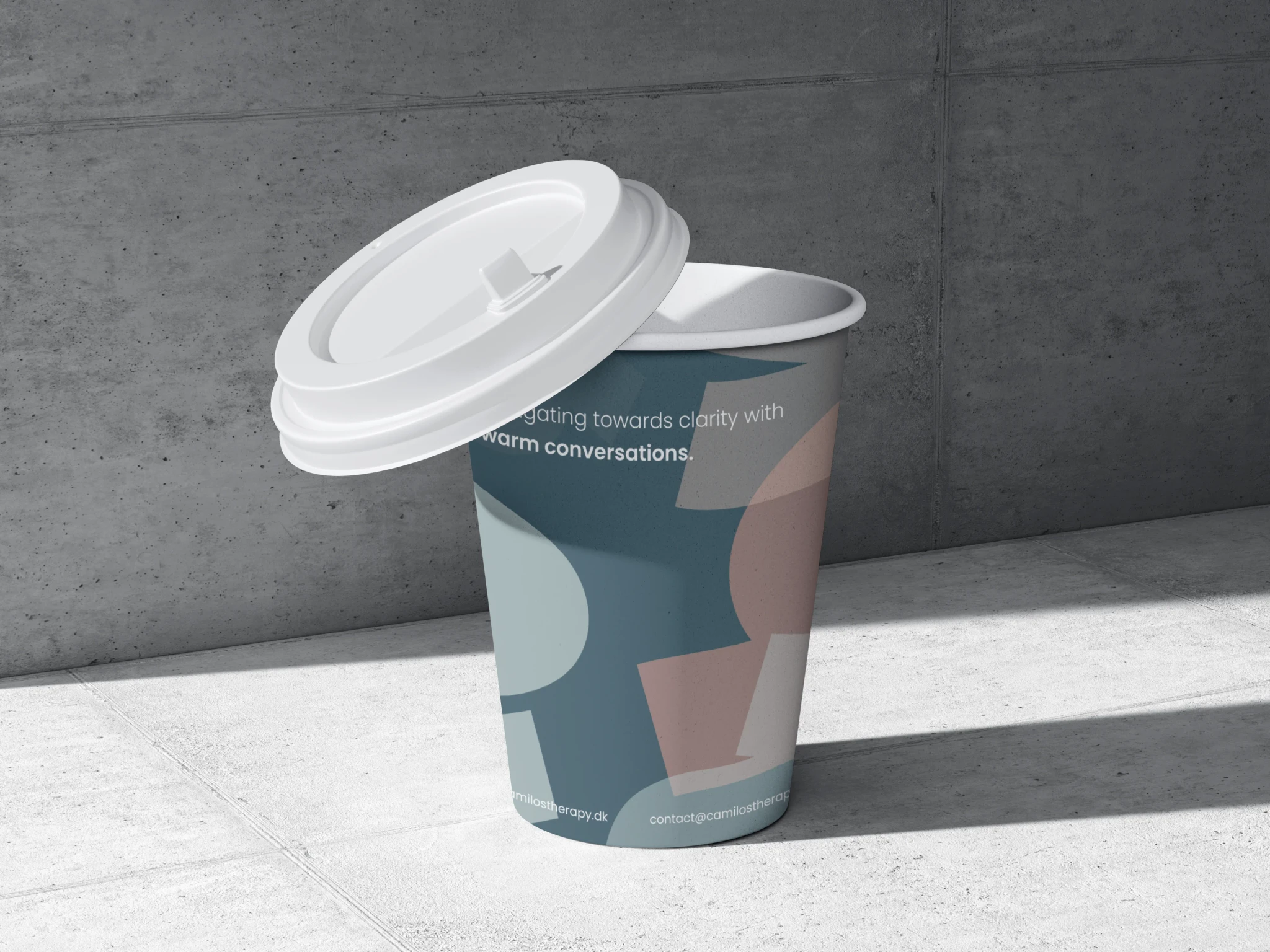
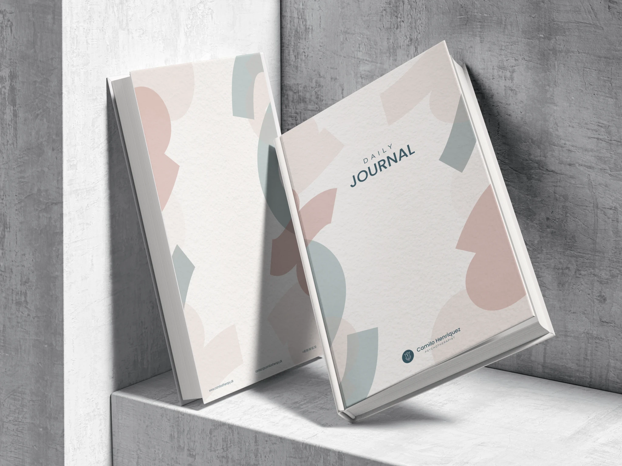
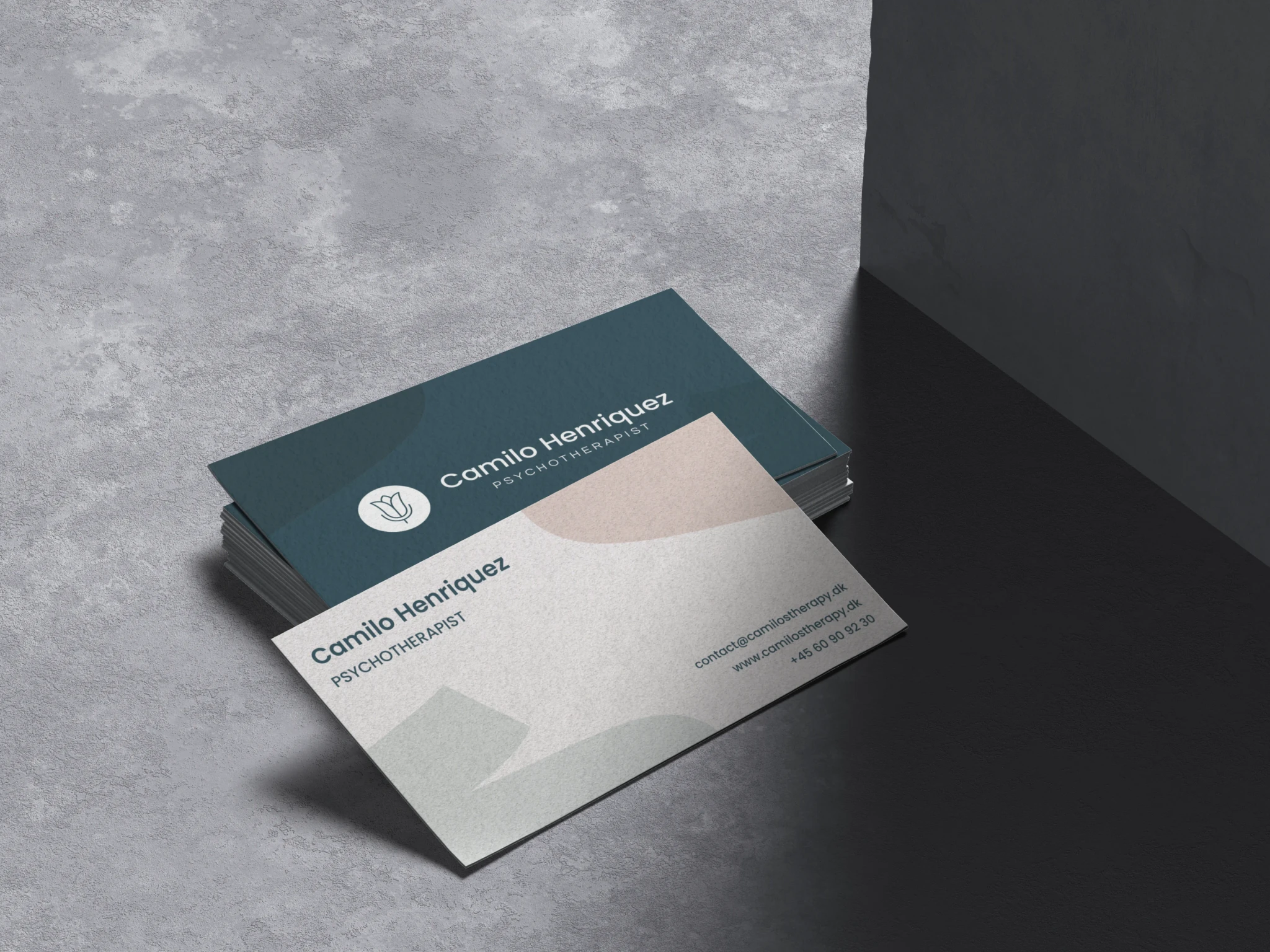
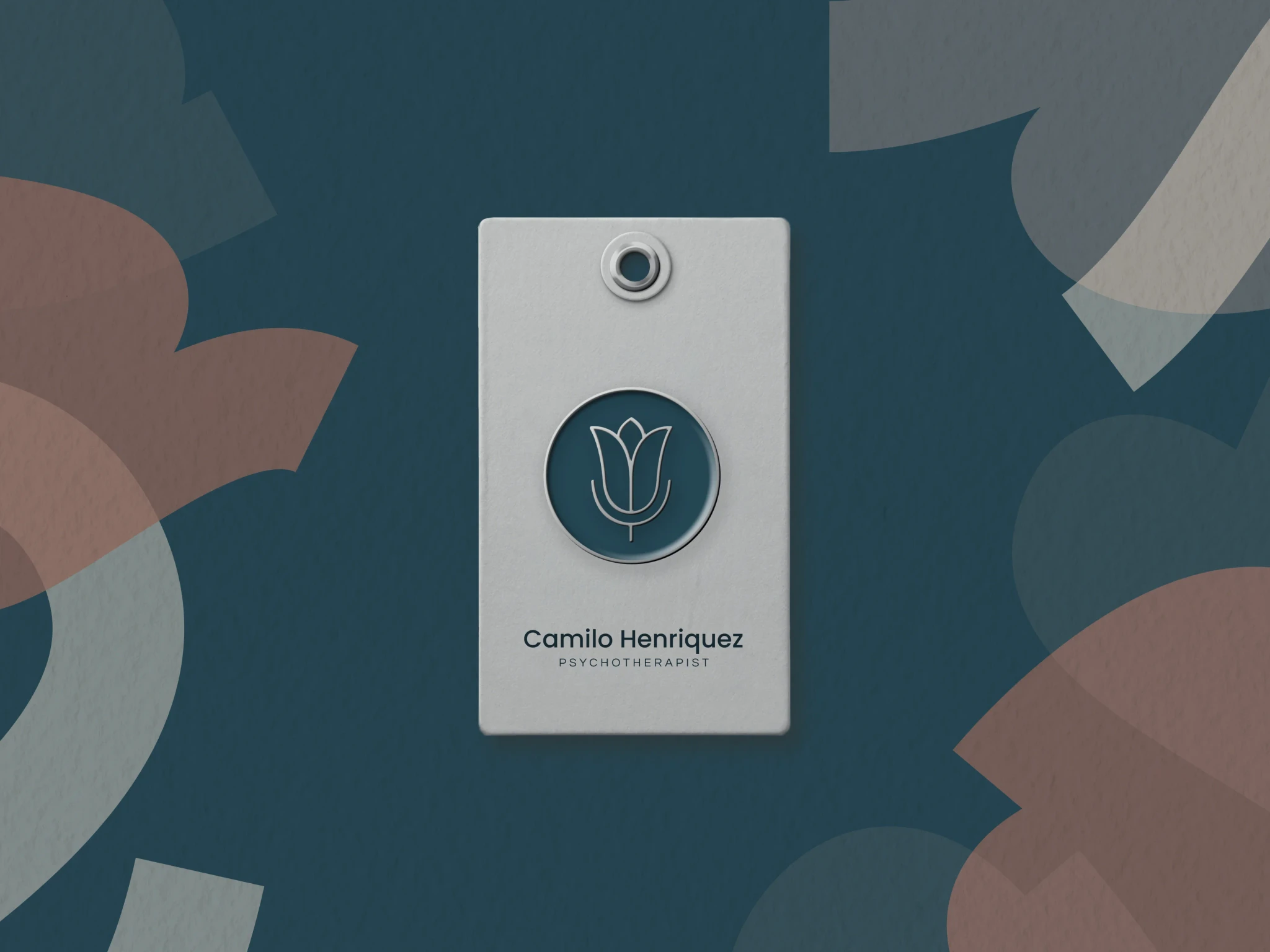
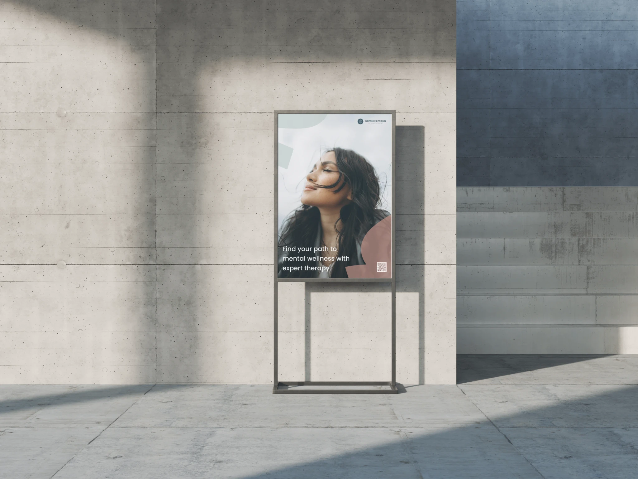
To enhance the visual identity and ensure its versatility across different materials and products, I introduced illustrations of marker highlights.
By using these elements, I aimed to visually represent how Camilo acknowledges and validates his clients' experiences and emotions. This approach shows his commitment to their well-being and growth, emphasizing empathy and support in their personal journeys.
06
what i have learned
Although the client liked the logotype style, he didn't fully resonate with the concept and ultimately chose a different proposal by a team member.
This taught me the value of working closely with the client and sharing ideas and concepts earlier in the process to ensure alignment in order to achieve a successful outcome for both parties.
