01
OVERVIEW
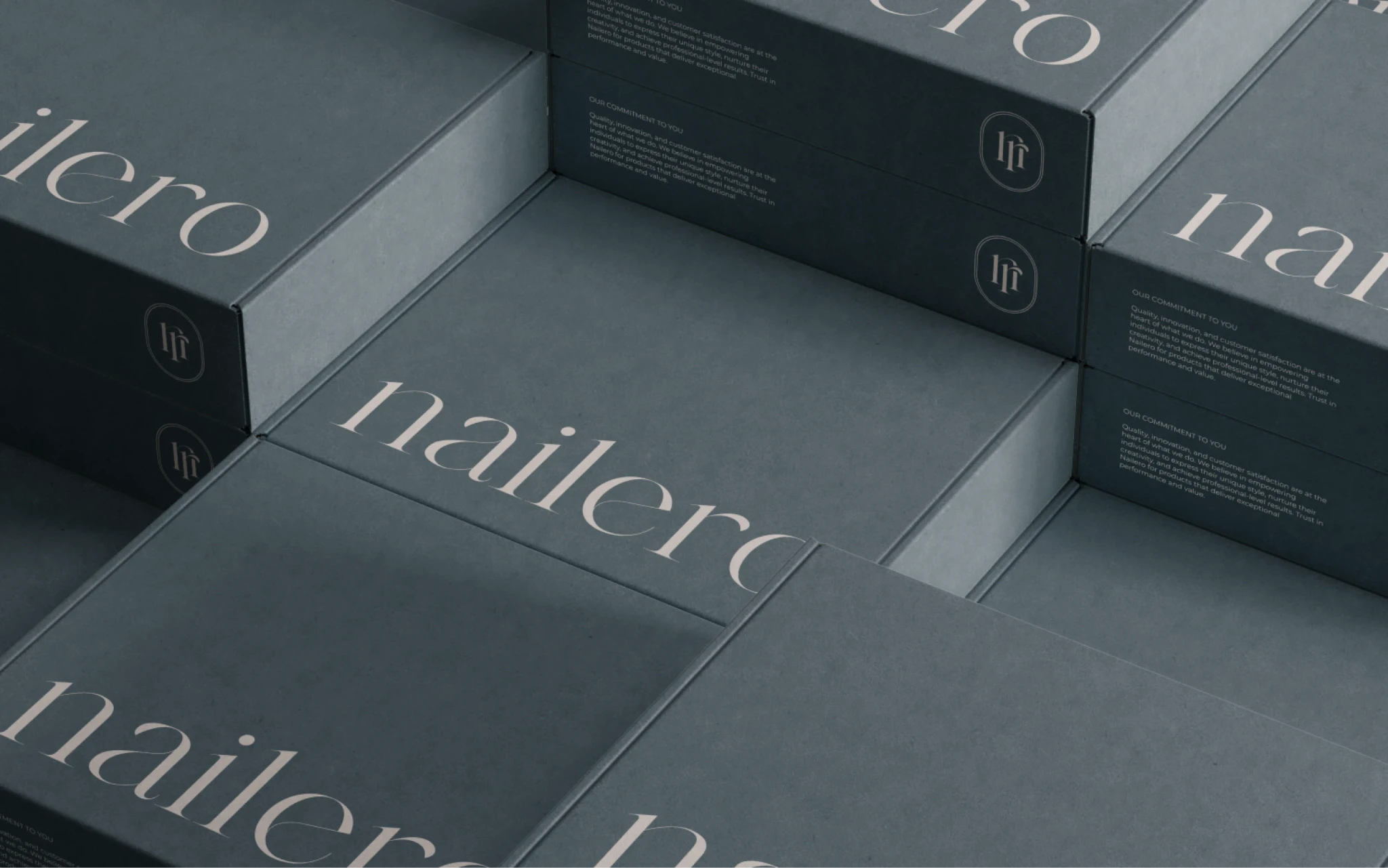
Nailero is an emerging online platform inspired by a decade of experience in the manicure industry. Founded with a commitment to quality and affordability, Nailero offers a wide range of nail care products for both professionals and beginners. The client approached me to develop a complete visual and brand identity from scratch, with the aim of reflecting the brand’s high standards and inclusive nature.
Client
Nailero
My role
Visual Identity
Brand Identity
Industries
Beauty & Personal Care
Project type
Client Commissioned
02
Problem
The client needed a cohesive brand identity that appealed to both professional nail technicians and DIY enthusiasts. The challenge was to create a sophisticated yet approachable visual identity that would stand out in a competitive market, reflect the client’s personal style, and resonate with a diverse target audience.
03
challenges
Creating a versatile logotype that works across different platforms and use cases.
Ensuring that the brand's visual elements (logo, colour palette, typography) consistently reflected the defined values and brand personality.
Creating a guide that anticipates all scenarios and offers straightforward instructions for the client on using the visual identity, in simple terms accessible to anyone outside the design field, ensuring clarity on what to do and what to avoid.
04
approach
Firstly, I conducted a questionnaire to understand the client's vision, personal style, and business goals. This included their aspirations for the brand, the target audience, and the unique selling points of their products.
These insights helped in formulating the vision and mission statements, which encapsulated the brand’s purpose and direction.
I further defined the core values that would guide the brand’s actions and communications. These values provided a solid foundation for the creative process.
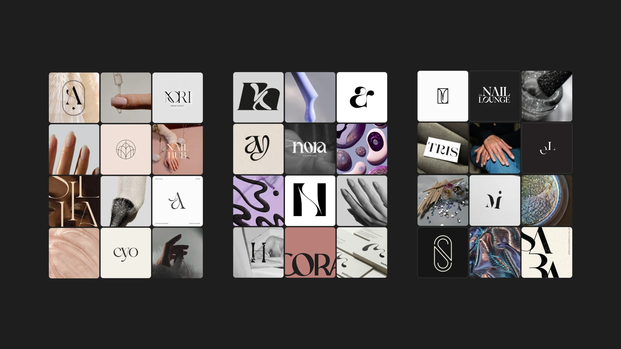
Consequently, I created three distinct mood boards based on the research and client’s preferences. Each mood board represented a different visual direction, reflecting various aspects of the brand’s potential identity.
The client chose the first mood board, which balanced minimalism with a touch of sophistication.
05
solution
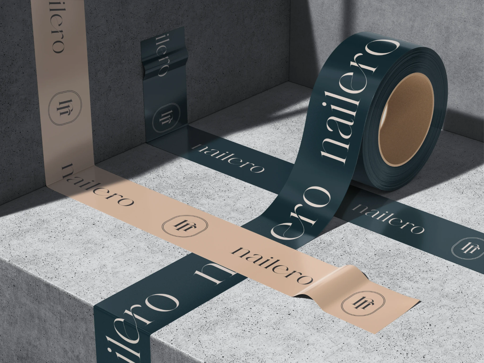
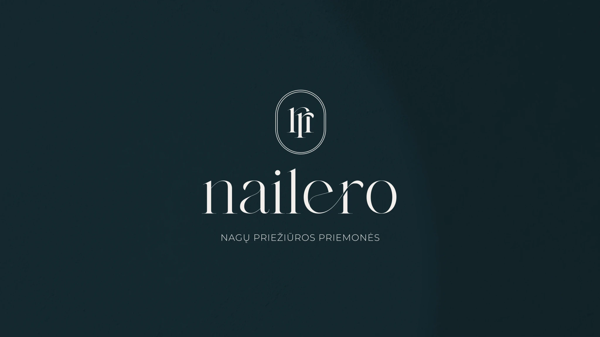
The solution for Nailero's visual identity focused on a clean and sophisticated design approach. Emilea, a serif typeface, was chosen for its elegant yet minimalist appeal, reflecting both quality and femininity.
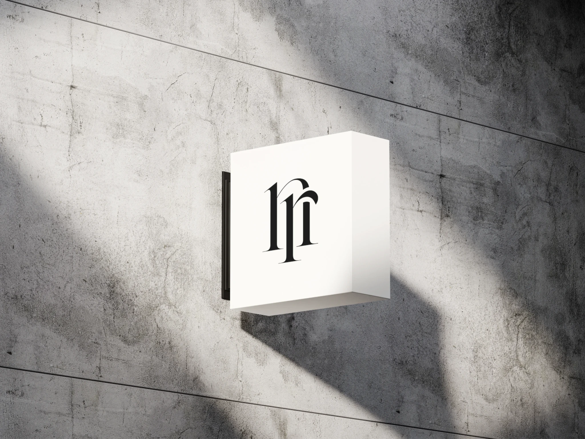
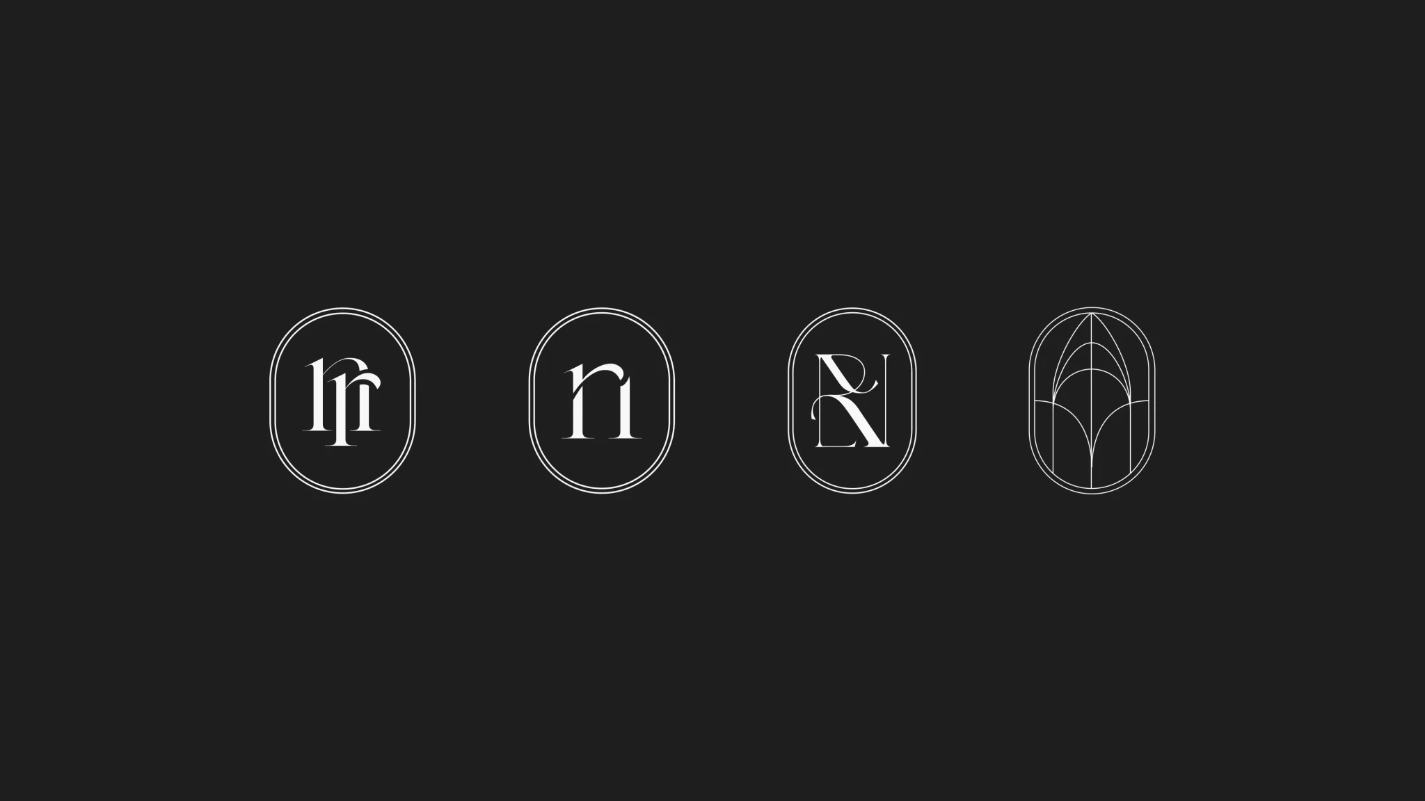
The logo design, featuring a badge-like symbol derived from the same typeface, was intentionally crafted to symbolize professionalism and expertise. Placing the symbol within a badge format was strategic, aiming to convey a sense of authority and trust—essential qualities for a brand rooted in a decade of manicure industry experience.
This approach not only ensures versatility across various applications, including social media icons, but also reinforces Nailero's commitment to offering high-quality, curated nail care products.
06
solution
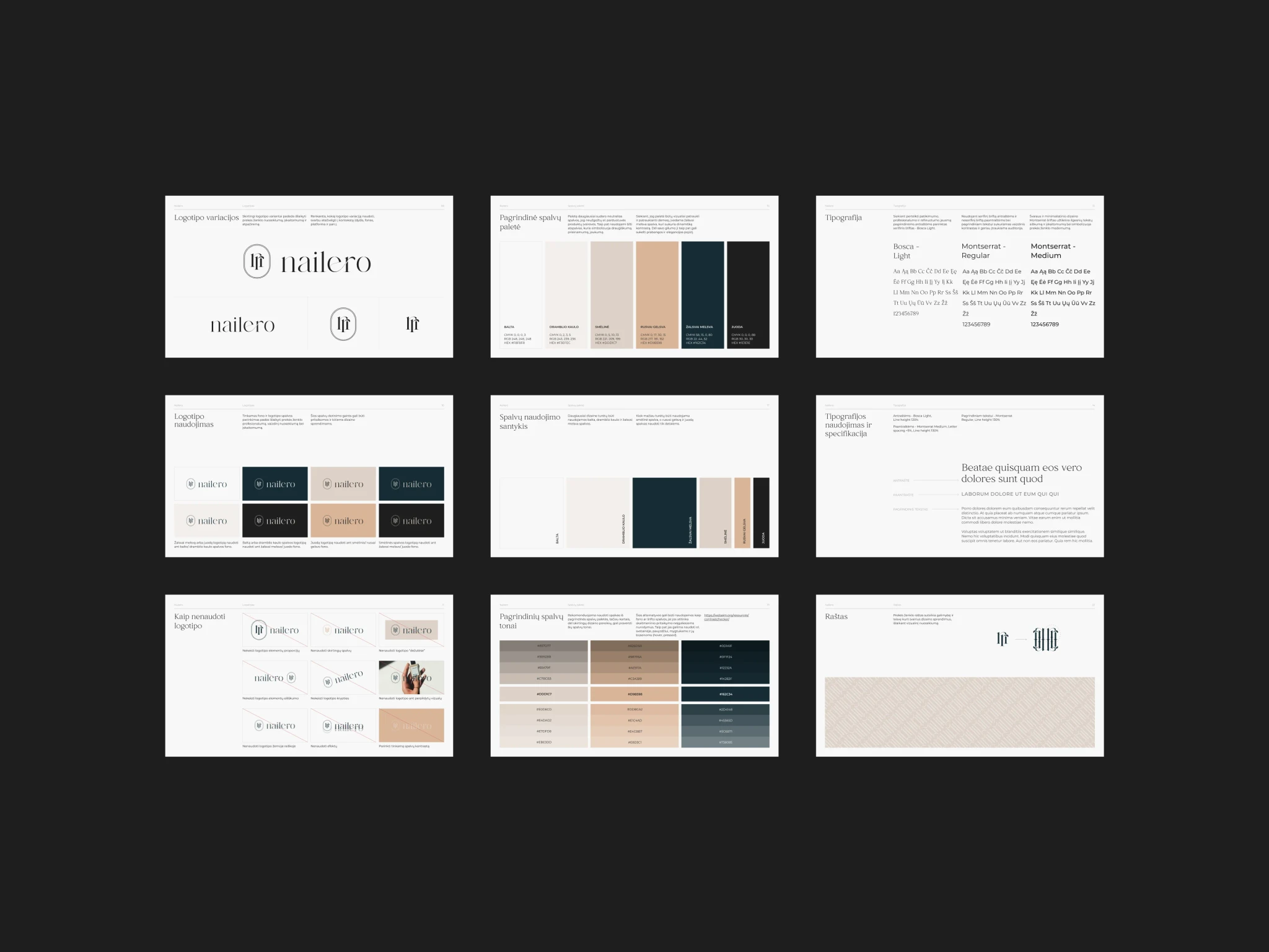
The colour palette consists mainly of neutral colours to not overshadow the variety of products in the e-shop. Warm tones symbolize friendliness, accessibility, and coziness.
To make the palette visually appealing and attention-grabbing, a teal color is introduced, creating dynamic contrast. Its depth also evokes a sense of luxury and elegance.
07
solution
To encapsulate all the research and solutions developed, I compiled a comprehensive visual identity guide for Nailero.
This document detailed the brand's identity with thorough explanations of each design decision and clear guidelines on applying the visual identity correctly.
It ensures Nailero maintains a consistent and professional appearance across all materials, establishing a unified presence in the market.
07
what i learned
This project was a valuable learning experience for me, as it pushed me to adapt to the client's preferred style, which was different from what I typically work with.
Additionally, it was rewarding to practice explaining design concepts in a way that was understandable to those new to branding and design, enhancing my ability to communicate ideas and justify my decisions clearly.
