01
OVERVIEW
The Lithuanian Sales Association, formerly known as SalesClub.lt , needed a comprehensive rebrand to reflect its transition to a state-scale association. The goal was to create a professional and cohesive visual identity that aligns with the association’s new status and mission.
Client
Lithuanian Sales Association
My role
Graphic Design
Visual Identity
Industry
Professional Organizations
Project type
Client Commissioned
02
Problem
Even though Salesclub.lt had gained recognition among Lithuanian sales professionals, embarking on this transition and adopting a new name meant potentially losing some of their established market reputation.
Due to this, the goal was to uphold a professional image that reflected their expertise and authority in the industry, despite their startup status.
Designing a visual identity that conveyed credibility, professionalism, and unity was crucial to ensure recognition and trust among their target audience.
03
challenges
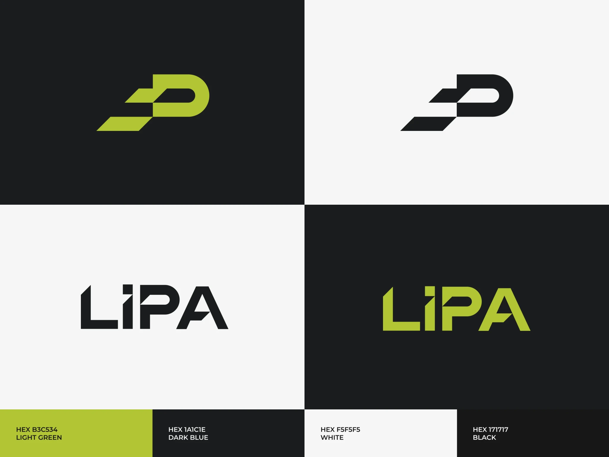
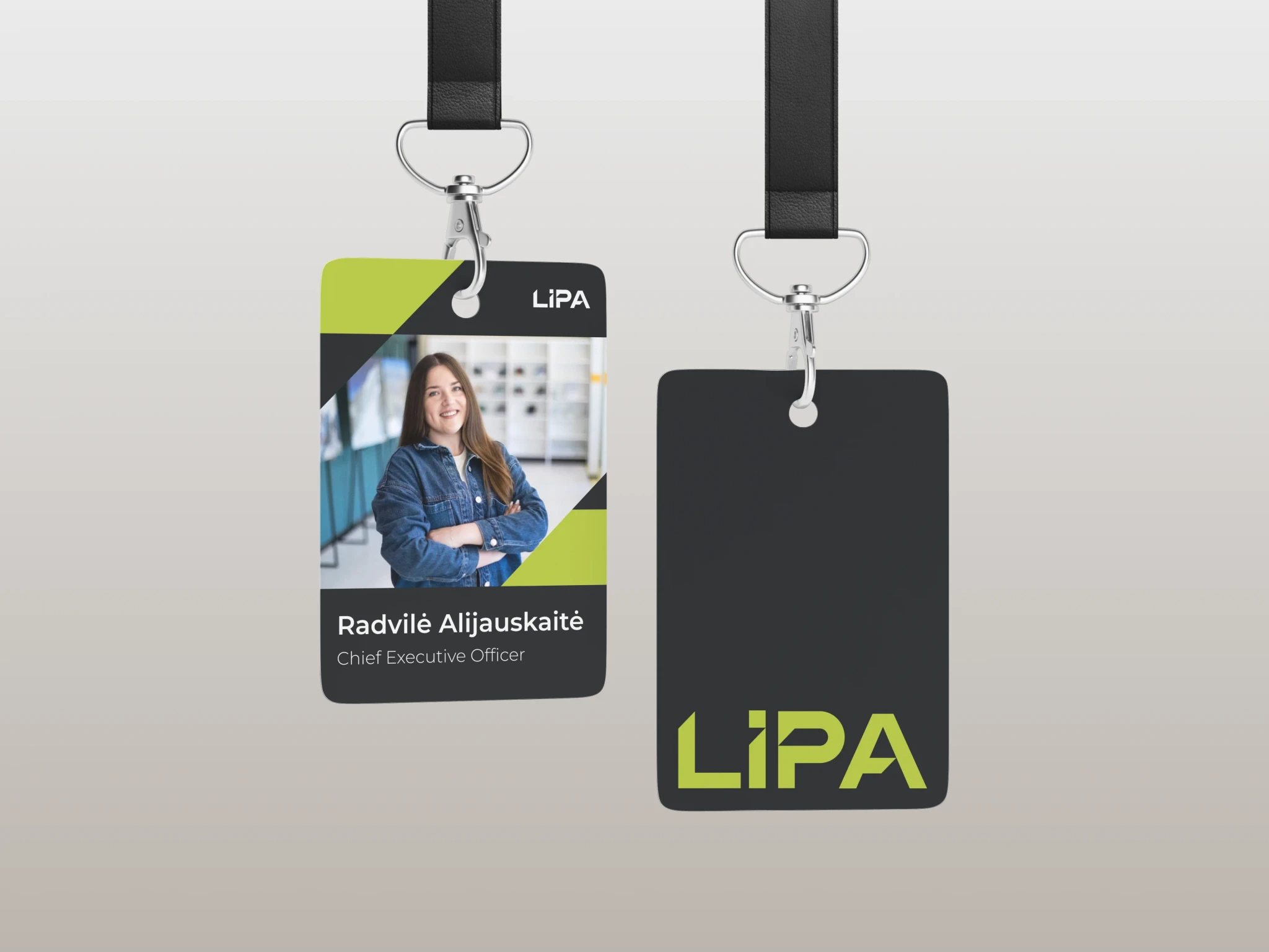
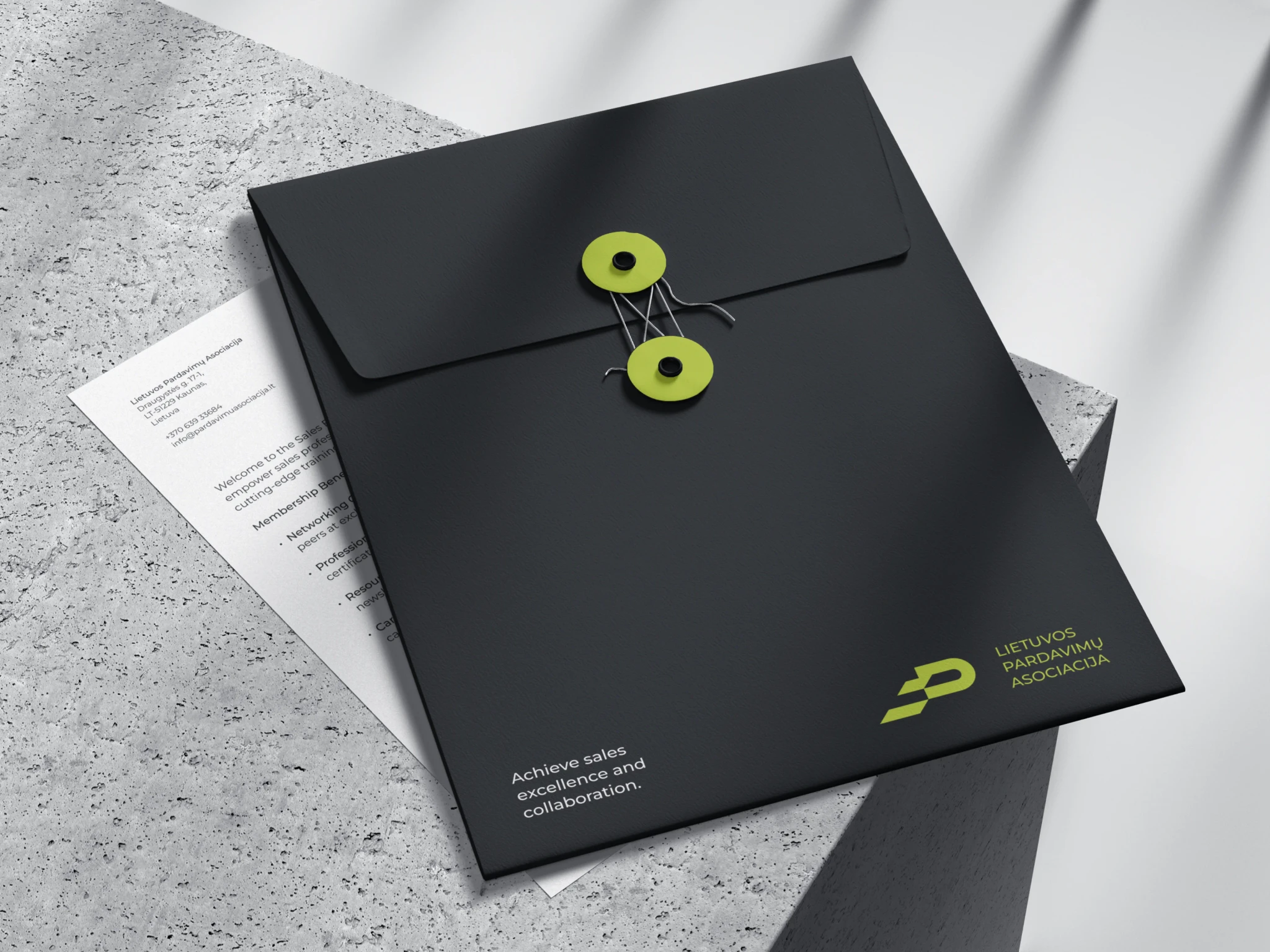
Balancing the versatility of the logotype across different variations — full name, abbreviation (LiPA), and symbol — presented a significant challenge.
I strived to ensure consistency and recognition while accommodating the varying uses of the association's name.
03
concept
It can be summarized that the association is dedicated to helping sales people climb to new heights in their careers.
To reflect this mission, the logo incorporates the element of stairs, representing the upward trajectory that members can expect when they join LiPA. This concept was born directly from the Lithuanian word “lipa” which means - climbs (lipti - to climb).
03
solution
To solve the challenge of creating a versatile logotype, I explored combining the letters "P" (pardavimų - sales) and "A" (asociacija - association) with the concept of stairs.
This design was applied to the full name logo and the abbreviation "LiPA" to maintain consistency.
04
solution
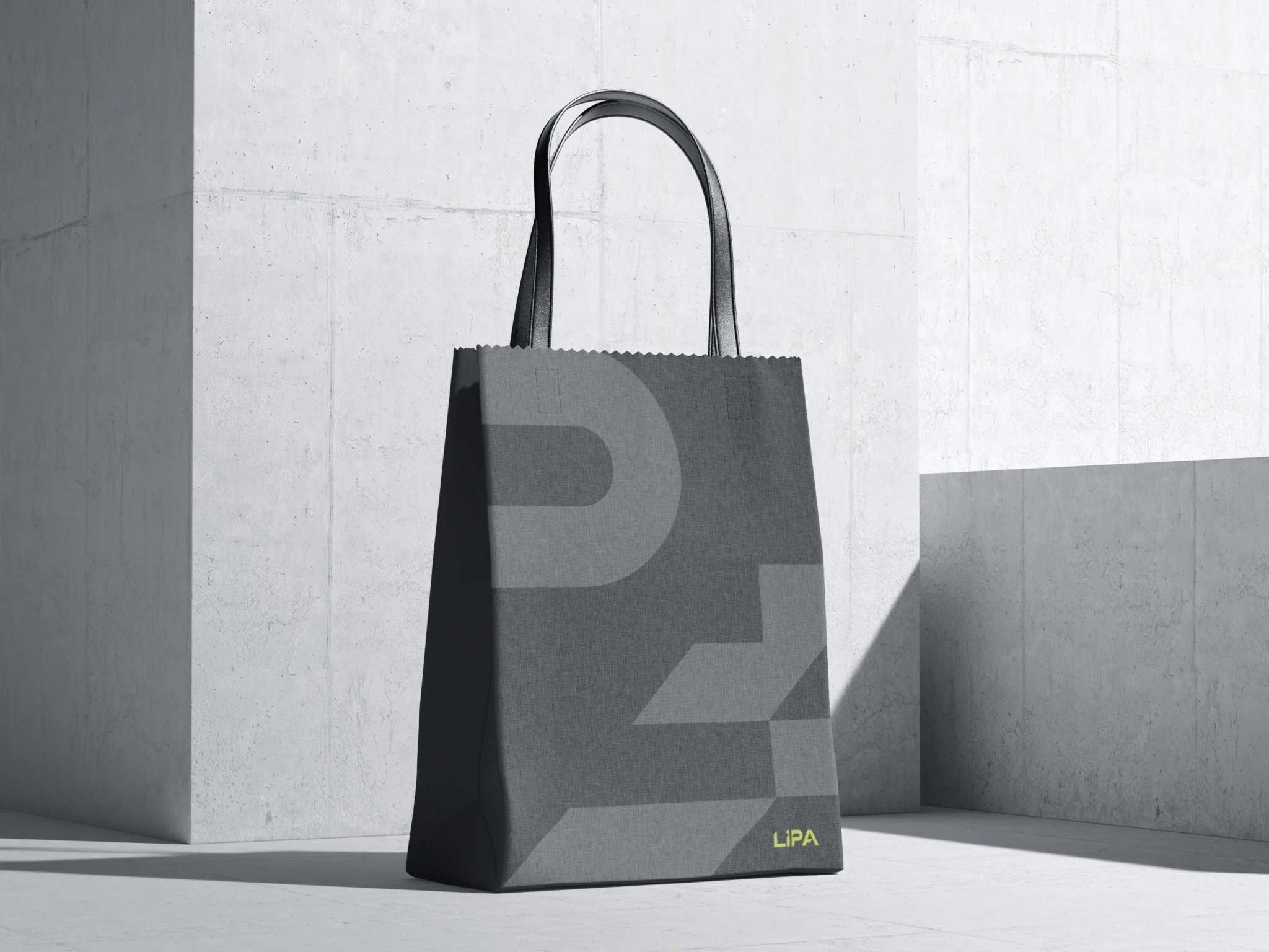
The sharp angles and geometric shapes in the logo were chosen to convey the dynamic, efficient, and strategic nature of the sales profession, reflecting movement and progression in the industry.
05
solution
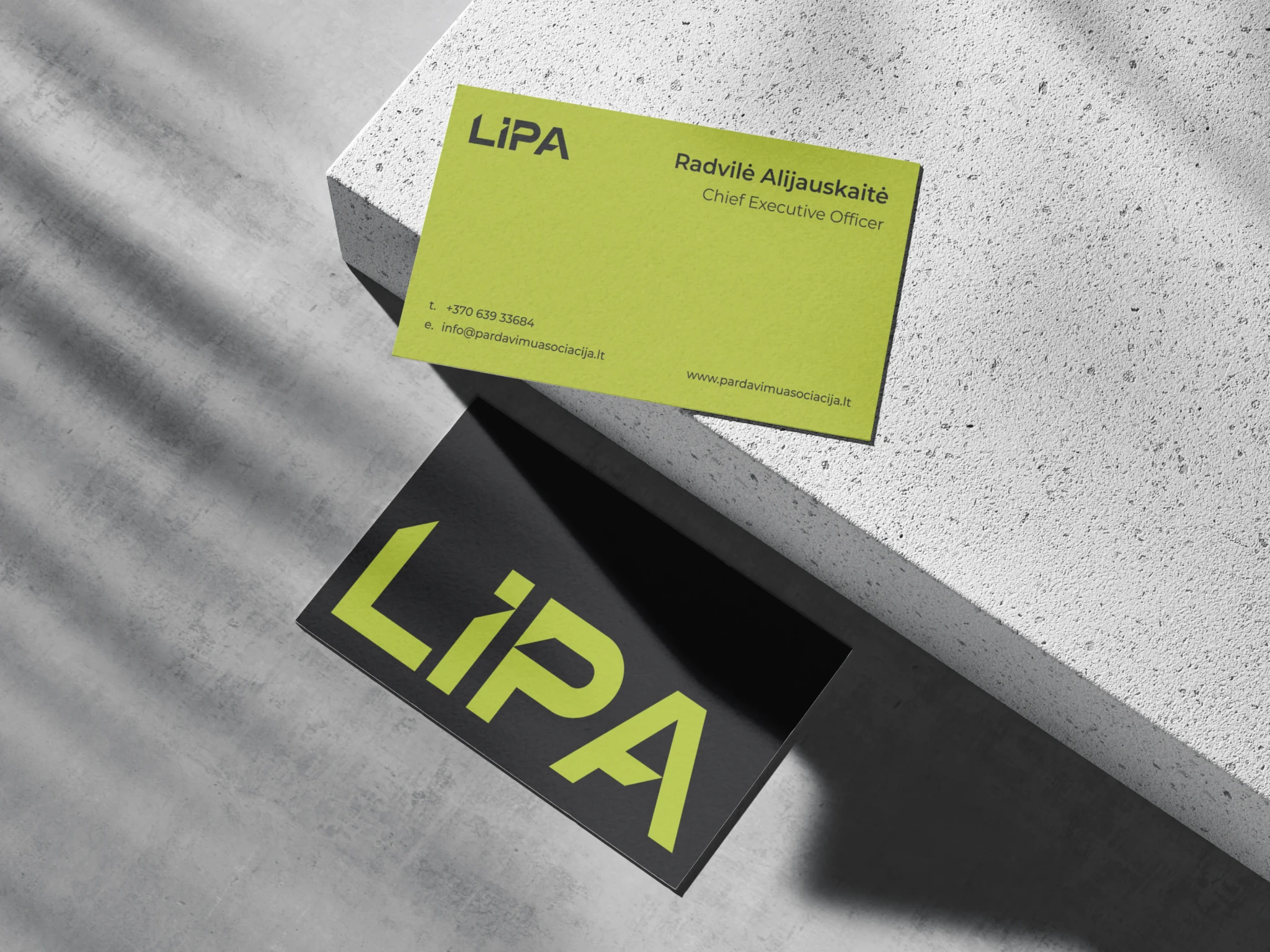
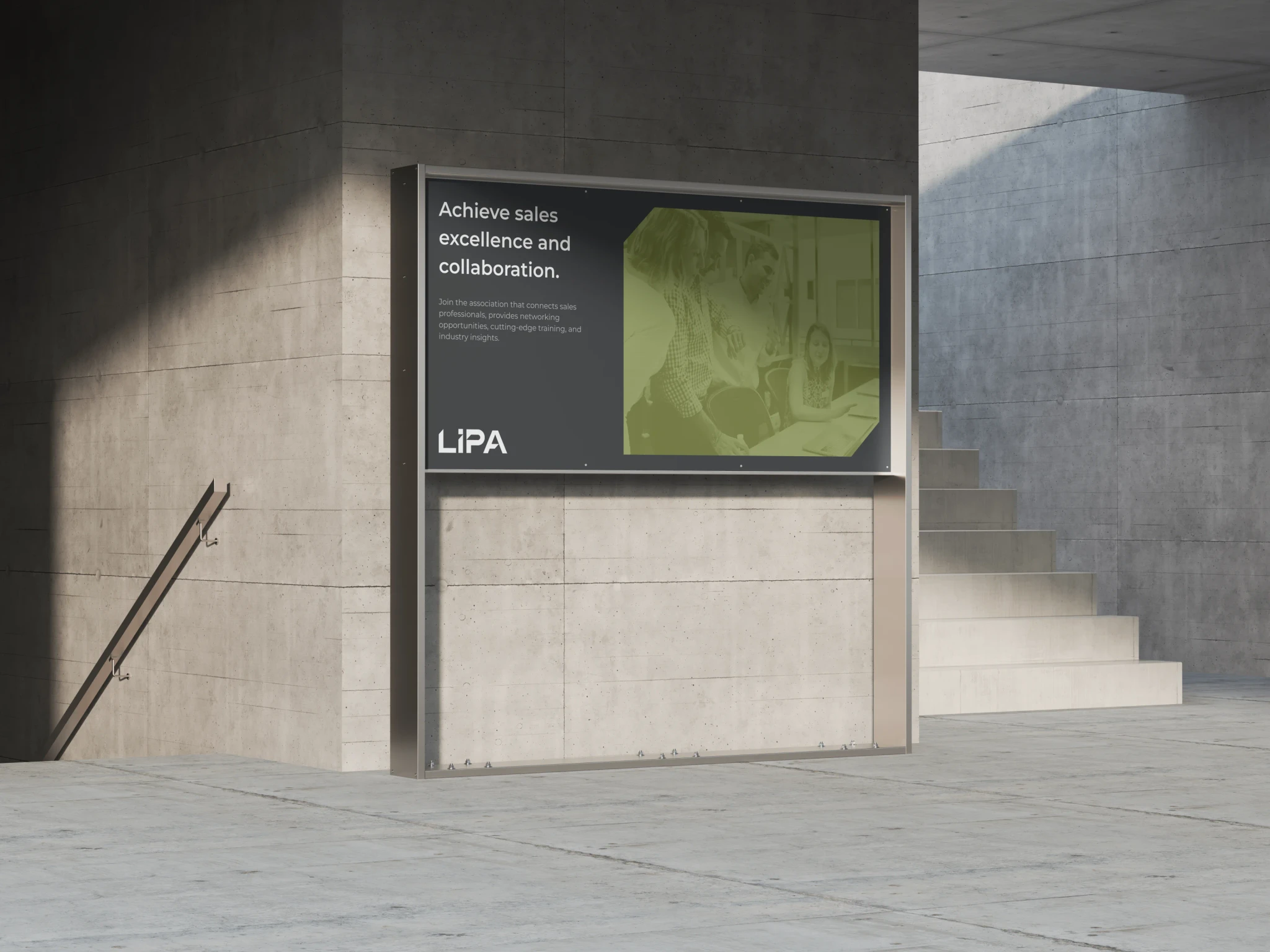
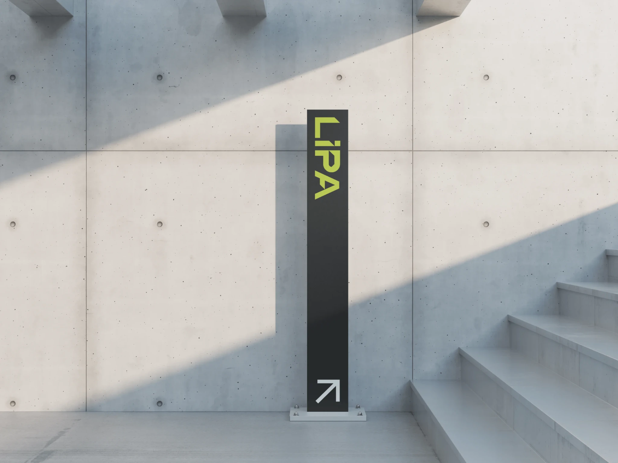
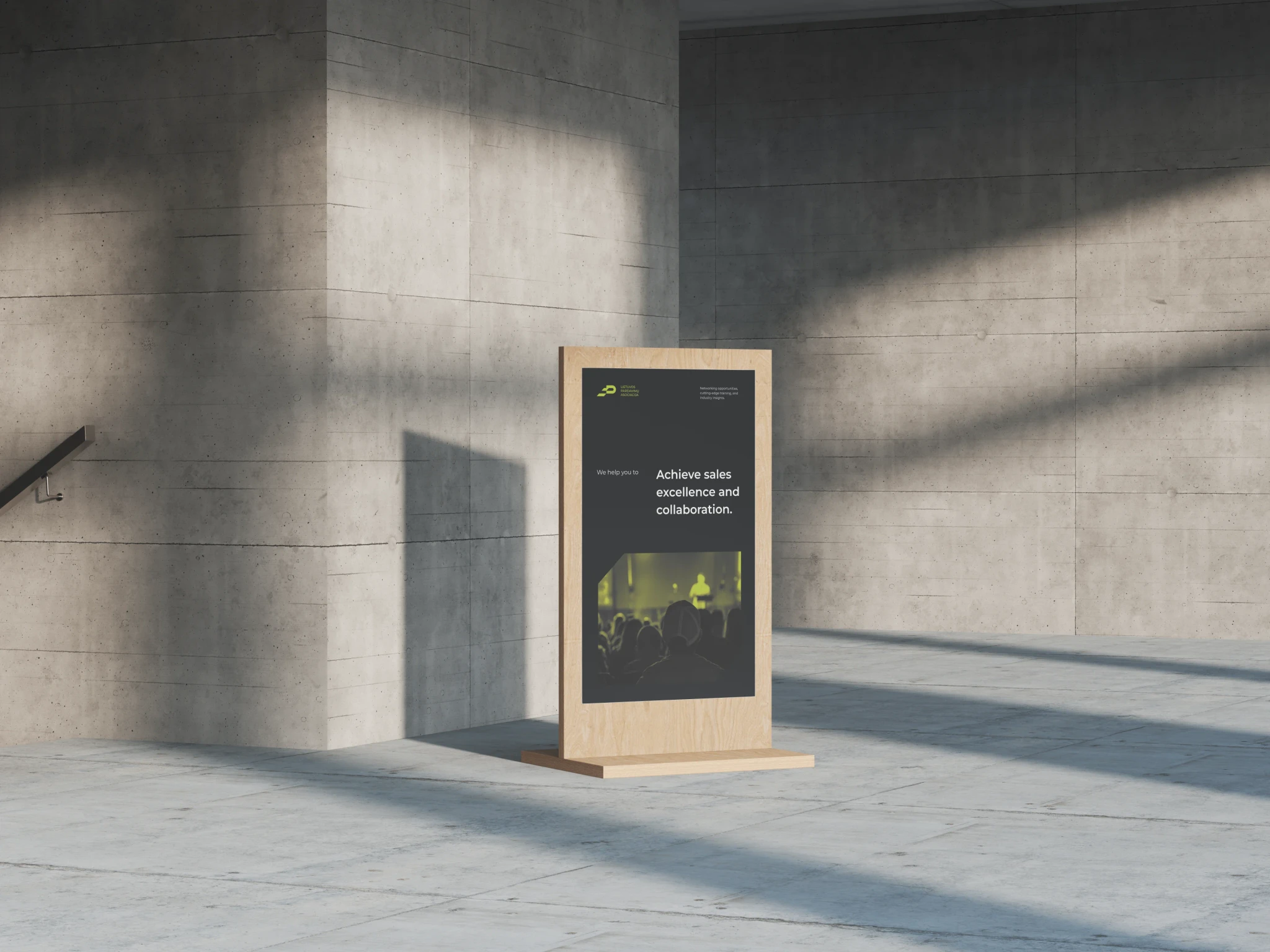
Given that the association was still a startup with limited resources to invest in design, it was essential to create a visual identity with simple yet impactful elements.
This approach enabled the client to easily produce banners, event covers, social media posts, and other materials on their own while maintaining a cohesive and professional look.
06
what i learned
This project required resilience as I initially struggled to find a suitable solution. The abstract nature of the sales field provided little to grasp for inspiring the logotype concept.
This challenge forced me to change my approach and think differently about how to represent the association visually.
Working on this project also inspired me to delve deeper into sales and marketing, helping me create compelling copy for print materials that emphasize the value for those considering joining the association.
