01
OVERVIEW
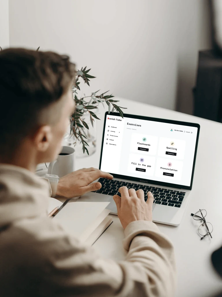
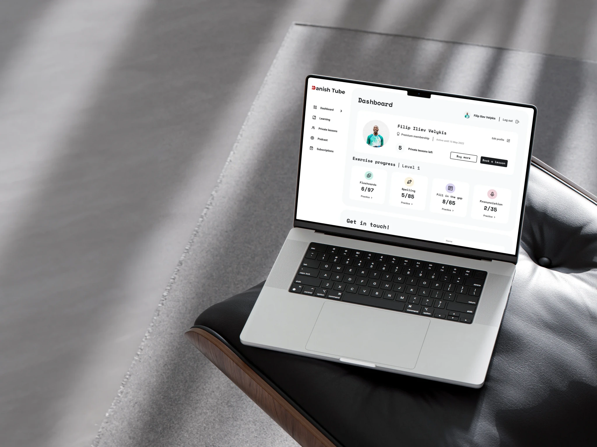
We partnered with Liam, the founder of Danish Tube, an online platform making Danish language learning accessible and enjoyable. Liam aimed to enhance his site to better support his services and products, ultimately increasing private lesson purchases. Our goal was to create a more engaging, user-friendly platform that reflected his belief in fun and interactive learning.
Client
Danish Tube
My role
UI & UX Design
Industries
E-learning & Online Education
Project type
Concept
02
Problem
In a saturated online language learning market, our challenge was to make Liam's platform stand out by integrating gamified learning experiences while highlighting the unique benefits of his private lessons.
We needed to differentiate Liam's offerings from competitors while maintaining a fun yet effective learning environment.
03
challenges
Conducting a thorough content inventory to organize the vast amount of existing materials.
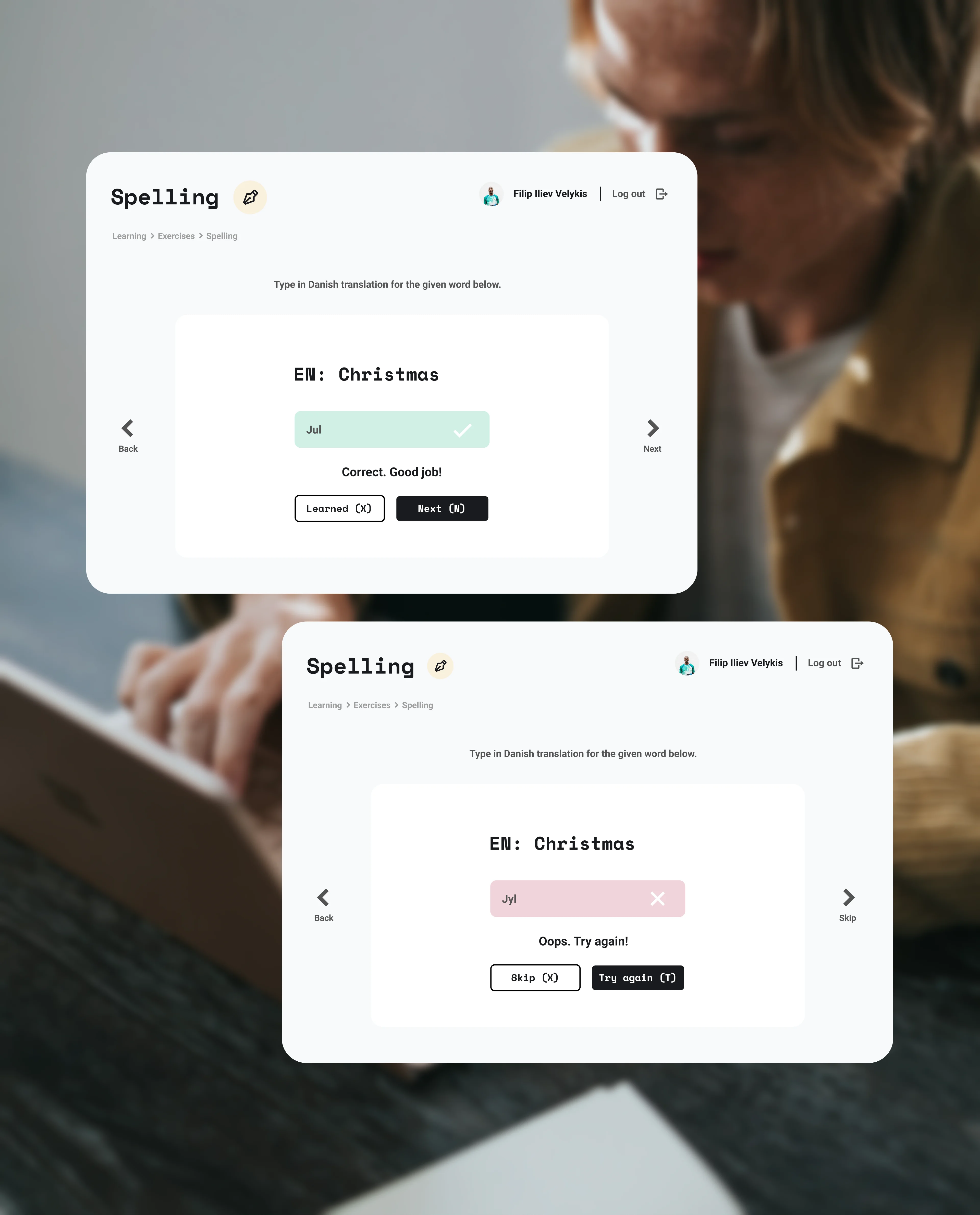
Incorporating game-like elements that provide feedback and keep the learning process engaging without overwhelming the user.
Designing intuitive UI elements that effectively communicate success or errors, guiding users smoothly through their learning journey.
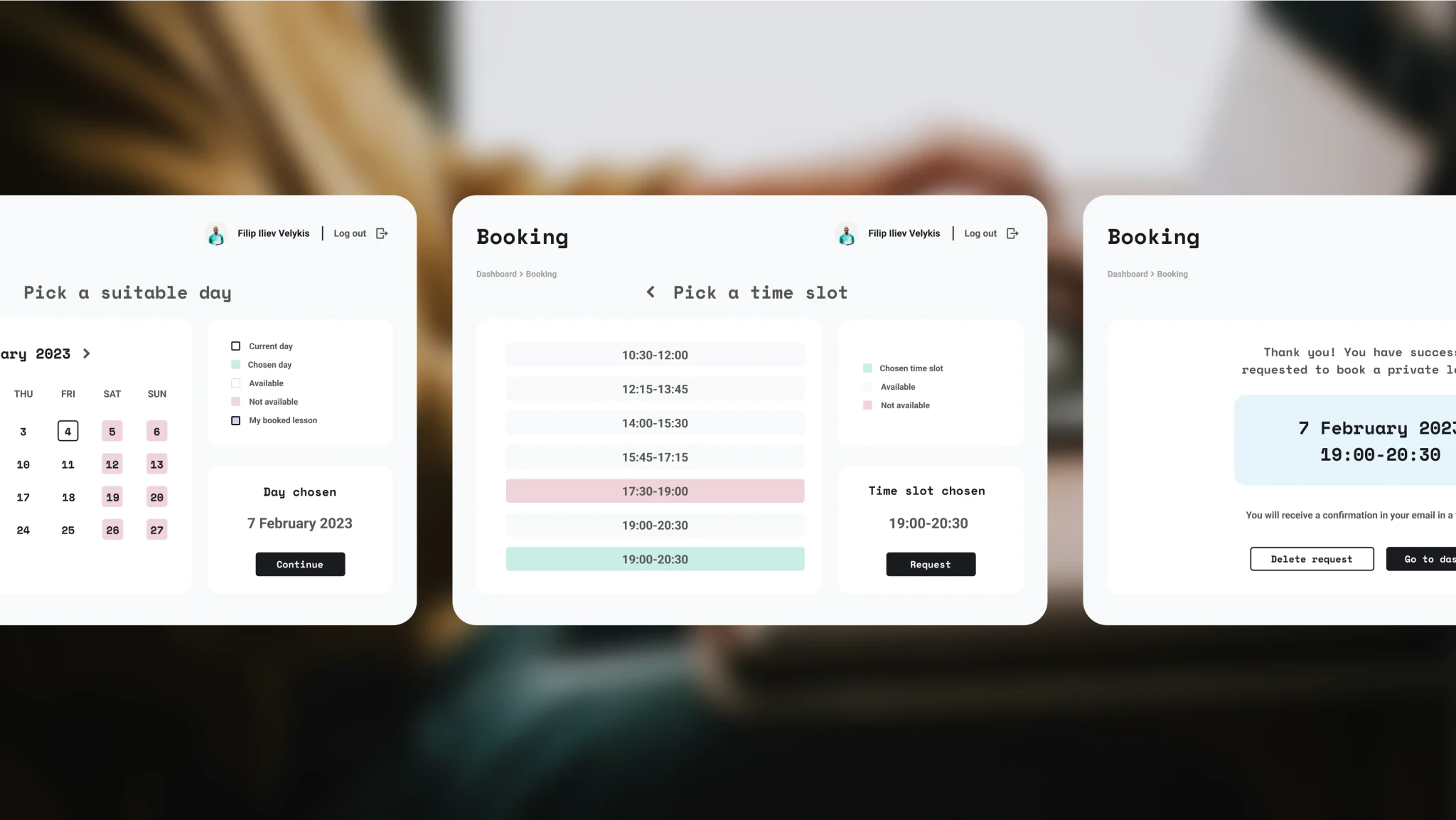
Streamlining the booking process for private lessons to ensure that users can easily see availability and benefits, reducing friction in the booking process to increase conversion rates.
04
CONCEPT
Liam's philosophy centers around making learning enjoyable, incorporating mini language games and interactive content to gamify the learning experience. This philosophy served as the inspiration for our design concept.
We wanted to balance the retro arcade game vibe with a welcoming and accessible design. Using bold geometric fonts and a variety of pastel colours to create a visually appealing site that doesn't strain the eyes or distract from the content.
The colourful sections were strategically employed to differentiate various learning modules, ensuring clear navigation and engagement throughout the platform.
05
SOLUTION
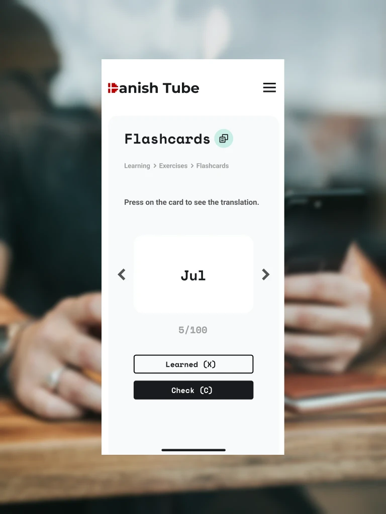
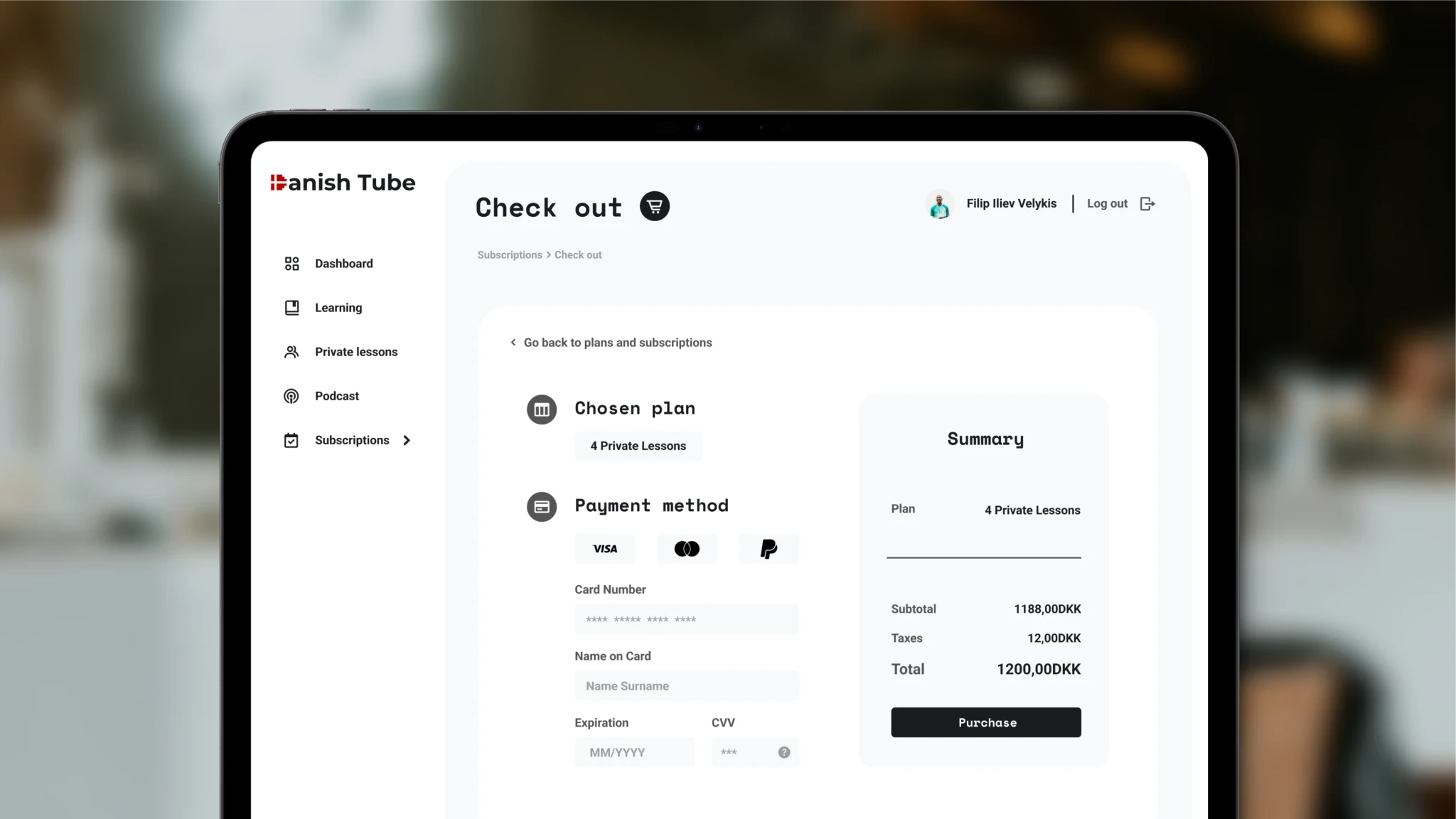
To ensure learning is accessible across devices, we embraced Liam's commitment to e-learning by implementing a modular UI design.
This approach made it easier to ensure that the platform is fully responsive.
06
solution
We optimized the booking process by introducing a color-coded key, clarifying availability and selections.
Additionally, step-by-step directions, indication of what the user has chosen, and breadcrumbs ensured seamless navigation, reducing friction and enhancing the overall user experience.
07
what i learned
This project taught me the importance of modular design thinking, as I directly observed how much it optimized the workflow for providing prototypes for responsive design.
Moreover, it emphasized to me the importance of providing feedback to the user. This served not only to improve the user experience but also to keep language learners motivated.
We aimed to encourage and challenge users by showcasing progress statistics, reinforcing their achievements, and guiding their learning journey.
